Posts tagged ‘Chicago Marketing Company’

February 9, 2011

Marketing to your Current Clients

One of your most important business assets is your customer list. You have established a level of trust with current clients, making it easier to get more business from them. But notice that I said easier not effortless. You must make the commitment to market your business to your current customers in order for them to decide to purchase from you again.

Marketing to your current customers has two valuable results: It boosts your sales and builds client loyalty. 

Maintaining meaningful contact with customers is important to your marketing success. It keeps you in the forefront of their minds so that when they are ready to buy, or when their colleagues need a referral, they think of you, your business, your product or your service.

So where do you start?

Know your customers. First you need to know your customers. Names, addresses, phone numbers, and e-mail addresses are obvious pieces of information you must gather. What have they purchased from you in the past and what is the average dollar amount of those purchases? By integrating your  business or internet marketing systems with other internal systems such as accounting, point-of sale, and customer relationship management systems, you can track what they purchased in the past and project what they may need in the future. Additionally, information regarding individual customer buying preferences, favorite radio stations and magazines, sports team loyalties and other data are extremely helpful in marketing to your current customers. So capture as much information as possible in a system that allows you to access it easily.

Meaningful contact. Use the information you have about current customers to send them relevant messages to keep them coming back. What messages are relevant? The answer may be different for each customer but the key is to use the data that you have gathered to respond to their specific product and service needs. Every customer has a distinctive combination of preferences, interests and demands that make them unique. The closer you come to addressing those needs in your communications, the greater the likelihood that you will get additional business from those customers.

Build loyalty. Another way to market to your current customers is via a rewards-based customer loyalty program. One of the best-known and longest running loyalty programs is the airlines’ frequent flyer program. The theory behind these programs is that customers will want to spend more money with your company in anticipation of earning their rewards. Your business will benefit most from a loyalty program that entices repeat purchases from customers and encourages them to tell others about your product or service. An added benefit to loyalty programs is that they give you the opportunity to gather additional information about your customers’ buying preferences and specific needs, allowing you to further target your business and internet marketingefforts.

For more marketing tips follow our blog! Chicago Marketing Company
If your business needs Graphic DesignWeb Design, orInternet Marketing, give us a call! 847-537-0067

Chicago Graphic Design

Chicago Print Design

Chicago Web Design

Chicago Internet Marketing

Chicago SEO

Chicago Marketing Company


January 21, 2011

The Future of Mobile Tagging or Mobile Shopping?

This is an interesting concept…though it could blow up in their faces if not done well. Personally I also think this is just another elaborate advertising scheme, but it is very innovative if I have to say anything.

January 20, 2011

Magic Lights and Your iPad

This is some of the most ingenious ways of using your ipad that I’ve ever seen. It took someone very intelligent to think this stuff up! The iPad is useful because it is a high resolution screen, very light, and very portable – so it’s perfect for their uses. The movie after the initial explanation of their process is pretty cool (and cute) at times.

Chicago Graphic Design

Chicago Print Design

Chicago Web Design

Chicago Internet Marketing

Chicago SEO

Chicago Marketing Company

January 13, 2011

Chicago Marketing Company Gives Back

In December 2010, the staff of a local graphic design and marketing agency, Integraphix Inc. have decided to partake in The First Annual Holiday Sponsor Day.
The reason for the event is to connect with one family or person in need in the community to improve their holidays by donating gifts, clothes, food, and toys.  The items donated will be chosen after the recipient is chosen and provided based on the suggestions made by the nominee.
The staff at Integraphix Inc. is hoping to spread the word about The First Holiday Sponsor Day to find a deserving person or family as well as encourage others to participate this giving season.  People in the surrounding suburbs of Chicago are encouraged to send in or email information about a friend, family member, or acquaintance that could benefit from the Annual Holiday Sponsorship.  They are also hoping to inspire other businesses to join in their efforts.
“We are hoping to make a difference and show that even small acts of kindness can make a positive difference,” said Scott Ventura, owner of Integraphix, Inc.  Other local business owners are encouraged to participate by contacting Integraphix Inc. to sponsor one of the nominated residents.
Unlike a coat drive, toy drive, or food drive, this event is aimed to give back on a more personal level.  It’s also a way to provide a uniquely chosen gift or sponsorship for a deserving individual.
Integraphix Inc. is a marketing and design agency located in Palatine Illinois, providing custom designed websites , marketing, consulting, and print designs for more than 20 years.  They have regularly taken part in other philanthropy programs such as: Letters to Santa, Compassion, and The Make a Wish Foundation.
For more information, to submit the name of a deserving friend or family member, please contact Integraphix Inc. at 847-537-0067 or email us at info@integraphix.com.
January 13, 2011

Great Photo Manipulation

If you’re like me, then you love a good photo-manip. Some of the great ones can express an amazing amount of emotion from a picture that would normally be unrealistic to photography in real life. Perhaps the subject of the photo isn’t based in reality at all and in fact could never be photographed at all. Deviant Art is a great source for finding these amazing artists and photo-manipulations. Take a look through these examples and see for yourself.

This for a moment that this artwork is from a free portfolio site – Deviant Art – and wonder why there is so much artwork in the world and professional scene that isn’t anywhere near this.

Chicago Graphic Design

Chicago Print Design

Chicago Web Design

Chicago Internet Marketing

Chicago SEO

Chicago Marketing Company


January 13, 2011

Bad Ad Alert!

Last year, Old Navy takes the cake in the retail genre with their creepy, talking mannequins who frequently pull their own limbs off to ‘offer you a hand’. No pun intended.  Not only are they creepy, but they’re generally making the rest of us feel like – ‘Wow, they couldn’t find models skinny enough, so they started using rail thin mannequins.’ While the colors and concept of the commercial is salvageable, the actual execution with strange smiling plastic people is not well done. Also oddly creepy is the booty reader that one sticks their butt cheeks to in order to determine their jean style needs. Their only redeeming quality in this situation is that they didn’t revamp their logo to resemble an oddly placed blue square.

See the commercial here.


Chicago Marketing Company


Chicago Graphic Design

Chicago Print Design

Chicago Web Design

Chicago Internet Marketing

Chicago SEO

Chicago Marketing Company


January 13, 2011

Amazing Ads

Sometimes the best ads are those that have the greatest shock value. Sometimes they’re insensitive such as the numerous ads that depict two smoldering cigarettes in place of the Twin Towers. Sometimes they’re brazen and make us look at the world in a different light. And sometimes, they’re just amazing.

The examples below are just a taste of the bold, beautiful and strange. Enjoy!

Nike

Nike is an obvious competitor in the sports world. They also have some pretty kick ass advertisers working for them. This ad, that takes their logo “The Swoosh” and turns it into a ski jump. Genius! Not only is it incorporating their logo into a sports related ad, but it’s really embodying everything Nike is about. Sports, ‘Cool’, and of course their iconic logo.  The blimp ad below is also pretty amazing since it’s not a photograph, but a digital rendering. It’s also impossible, using the laws of physics, for this blimp to actually float like this, but it’s a nice visual.

Nike

January 13, 2011

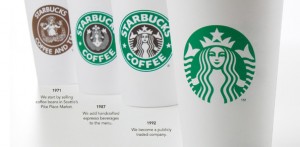
Starbucks changing their logo?

Starbucks is the most well known coffee company in the world. So why is it suddenly putting a Gapfu and changing its logo? Gone is the actual NAME of the company and what remains is a slightly different, stylized version of the siren that’s been present on every Starbucks cup since the company launched. I am personally not a fan of the new logo, but I will inevitably still buy their coffee and frequent their shops, but it remains to be seen how the public will react to the new branding. One entirely credible publication said that the new logo had satanic imagery embedded within the siren’s crown (ie. the pentagram on top of her head) but I’m not sure how far that story is going to fly.

Besides the fact that I dont think the new logo is very attractive without the company name surrounding it, the move is a ballsy on Starbucks part simply because they’re banking on the fact that their signature logo – the siren – will be recognizable even without having the words ‘Starbucks Coffee’ on the cup. The green and white combination is enough at this point. It goes without saying that this is on the level of McDonalds in branding power, when the colors of a company spark the thought of them. You would never have a red and yellow wedding would you? No… because your family would say it looks like McDonalds. That’s powerful stuff people! Perhaps someday blue and white will be synonymous withIntegraphix!

What do you think of the new Starbucks logo?


January 13, 2011

Most Severely Annoying Ads of 2010

Progressive Insurance:

Chicago Marketing Company

See the video here. It cannot be Unseen.

We kick off the New Year with some of the worst ads ever released in 2010. Some of them are horrid; some of them are shocking and some of them we just wonder who was asleep when this got approved. We’re all aware that a good ad campaign can boost a company’s sales for years to come, especially if the ad resonates with the consumer across all age groups and countries, but a bad one can become a joke just as quickly. One of the biggest blunders of the year was Flo – the Progressive saleswoman who just won’t shut up. To pour salt in the wound, they keep using her! Nobody can figure out why this is, since her voice is annoying and the whole concept of picking a box off a shelf and calling it custom insurance is a little backwards. It makes the company look like they mass-produce auto insurance instead of customizing it to the buyer.

State Farm Insurance:

Chicago Marketing Company

See the video here.

The next winner is the State Farm ‘Pocket Agent’ – I’m also not a fan of the little jingle people sing and a person pops into existence. But the pocket agent ad is unduly annoying: The agent is constantly interrupting the other actor throughout the 31 seconds the commercial lasts, the main actor get increasingly annoying throughout the commercial as his scruffy face and unwashed hair are all too un-state farm agent-like and the floating squares of the State Farm logo are about as annoying as a bad Windows screen saver. Most reactions to this commercial are the same as above – with many people immediately expressing distaste for the man in the commercial. One YouTube comment wasI had a nightmare about this guy a few weeks ago. His hairline makes me angry. My stomach legit gets upset when I see him on tv.’ Now, YouTube comments must be taken with several grains of salt, but the message is clear: They really picked the wrong actor for their Ad. His voice and overall appearance are not palatable to the American consumer – he looks dirty, his voice is annoying and the interrupting (a common pet peeve) easy irritates people to the point of turning the channel. Also, his laughing off of said interruption with a smile and an ‘oh ha-ha!’ is enough to make some wrinkle their nose. The flirting at the end could’ve been done without also. I’m not sure about you, but us here in Chicago can’t stand it.

5-hour Energy:

Chicago Marketing Company

This commercial bothers me on a level that I cannot express. The first time I saw the commercial, it actually made me angry. My thoughts were ‘Why is she working two jobs and her husband is sitting on his butt in his sweatpants?’ Granted, I’m assuming the writers were trying to express sympathy for what many Americans are going through at this point in time – one person who is unemployed and one person who has taken on a part-time job to make up the difference. It is an attempt at connecting with the audience on a personal level, but portraying the wife as a stressed out wife, mother and bread winner while the husband is in his sweatpants waiting for her to come home and make dinner is something that the general American public doesn’t like to be confronted with. The message that the energy drink can help her get through her day without adverse effects is lost in the visual of a struggling middle-income family. Whoever designed or came up with this marketing campaign didn’t do so with any sensitivity to the times.

Chicago Graphic Design

Chicago Print Design

Chicago Web Design

Chicago Internet Marketing

Chicago SEO

Chicago Marketing Company


January 13, 2011

Pantone 2011 Color of the Year!

Honey Suckle! And not yellow. It’s pink!

I approve. So does the boss.

Chicago Marketing Company